

Retirement is a fresh chapter—a chance to redefine how you spend your days and, just as importantly, where you spend them. For many active retirees, this means finally turning their home into a space that feels joyful, energizing, and unapologetically personal.
After decades of choosing “neutral” and “safe” for the sake of resale value or practicality, now is the perfect time to shed the beige and embrace colour and character in your renovation choices.
Why Colour Matters More Than Ever
Colour isn’t just about aesthetics—it’s about energy, emotion, and how a space makes you feel. Studies show that rich, warm tones can boost mood and promote relaxation, while cooler hues offer a sense of calm and clarity. For active retirees seeking to enrich their daily experience at home, thoughtful colour choices can play a significant role.
Insight:
Embracing colour isn’t just bold—it’s deeply personal. It reflects your story, your tastes, and the freedom to choose style over convention.
Colour Psychology for Every Room
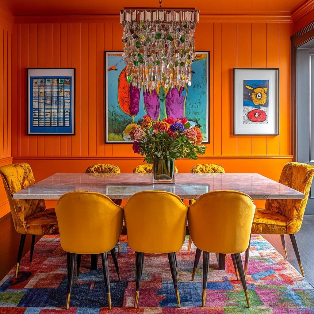
Different colours evoke different emotions. Red adds vibrance and energy—ideal for spaces where you entertain or dine. Blue brings calm, making it well-suited for restful environments like bedrooms or bathrooms. Green offers freshness and works beautifully in kitchens and home offices. Yellow can brighten a breakfast nook or hallway, and softer tones, such as lavender and blush, lend a peaceful, feminine elegance.
Rather than relying on beige to make a space feel “safe,” using strategic colour choices helps create mood, define purpose, and elevate everyday living. Consider how colours interact with both natural and artificial lighting at different times of day. Soft sunlight in the morning versus warm evening tones can dramatically influence how a colour is perceived.
Reclaiming Your Space, One Room at a Time
Now that your design choices no longer need to cater to children or potential buyers, you can explore what really brings you joy. Maybe you’ve always dreamed of a rich navy kitchen or a blush-toned reading room. Now’s the time to bring those dreams to life.
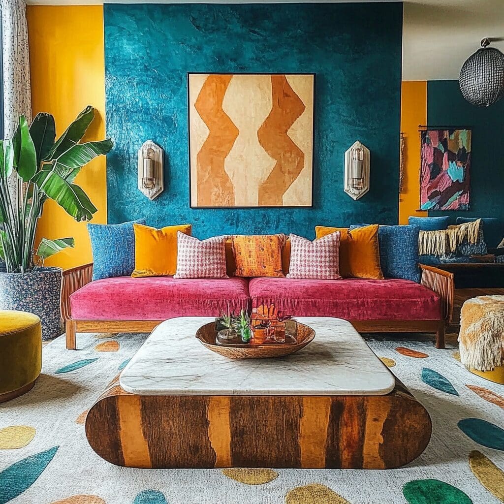
In the kitchen, cabinetry in soft sage or deep charcoal paired with patterned backsplash tiles adds flair without overwhelming. Bathrooms can become spa-like sanctuaries with teal walls and brass fixtures. Living rooms come alive with layered textiles, dusky plums, and art that reflects your personality. And bedrooms? These are your personal sanctuaries—ideal for muted tones or bold statements that help you relax and recharge.
Tip:
Choose one room to start your colour journey. Often, the smallest rooms—like a powder room or hallway—make the biggest impact when infused with bold hues.
If you’re unsure where to start, consider your daily routines. Where do you spend the most time? What activities bring you the most happiness? Let those guide your initial renovation efforts. A room you use every day should feel energizing, nurturing, or peaceful—whatever complements your lifestyle best.
Common Colour Mistakes to Avoid
One of the most common pitfalls is overcommitting to a colour without testing it first. Display paint swatches on the wall and view them at different times of day to observe how lighting affects the shade.
Another frequent error is ignoring undertones. Combining cool greys with warm beiges, for instance, can create visual tension unless executed with intention. And remember: trends come and go. Just because a colour is popular doesn’t mean it’s right for you. Make choices that align with your lifestyle, not just those inspired by Pinterest boards.
Additionally, many homeowners try to force too many colours into one space. A palette that feels chaotic or overstimulating can lead to discomfort in areas meant for relaxation. Stick to a few intentional choices and let finishes, textures, and natural elements do the heavy lifting in adding variety.
Accessorize with Confidence
If painting feels too permanent at first, start with accessories. Throw pillows in jewel tones, patterned rugs, colourful window treatments, or bold artwork can all shift the mood of a room. Lampshades, bedding, and accent furniture, such as ottomans or chairs, are low-commitment ways to test your colour comfort zone.
Strategy:
Start with a three-colour rule: choose a primary colour, a secondary that complements it, and a third for contrast or surprise.
Consider also mixing in elements of nature. A bold colour paired with natural materials like wood, rattan, or stone helps balance vibrancy with grounded, familiar textures. For example, an emerald green wall in the bedroom becomes less dramatic when anchored with light oak furniture and woven storage baskets.
Let Go of Outdated Rules
Outdated advice, such as “keep everything neutral for resale” or “don’t mix styles,” limits creativity. Today’s design world embraces layered textures, vintage-meets-modern aesthetics, and personal touches that make a house feel like a home.
What once was seen as a design faux pas—mixing florals with stripes or pairing brass with black hardware—is now celebrated for its originality. Your home should reflect your journey, not someone else’s checklist.
There’s no single “correct” way to use colour. What’s most important is that your space feels authentic and enjoyable to you. Confidence in your choices grows with each small success. Start with one wall, one accent chair, or one set of curtains—and build from there.
Reminder:
There’s freedom in knowing there are no wrong answers—only opportunities to discover what feels right for your space and spirit.
Blending Colour with Functionality
Colour isn’t just decorative—it can also be deeply functional. When thoughtfully applied, colour can improve navigation, define zones in open-concept homes, and subtly guide behaviour. For example, painting an accent wall in a soft green behind a reading chair naturally draws you into that space, encouraging rest and stillness. Meanwhile, energizing tones like citrus or coral can define an active corner for yoga or painting.
In multi-use spaces, colour can help signal transitions. A soft blush wall behind your work desk can separate it from the rest of the bedroom without adding physical barriers. Entryways and mudrooms benefit from deeper, grounding colours like navy or forest green that can both hide scuffs and establish a welcoming tone.
This approach also supports accessibility. Using contrast—such as darker cabinetry below white countertops or coloured tile borders—can help improve visibility for those with declining eyesight. As we age, these subtle but impactful details enhance both safety and independence without compromising style.
Application:
Use colour to guide daily routines—whether it’s creating a calm zone for morning coffee or energizing a workspace for afternoon productivity.
Final Thought: Say Yes to You
This stage of life is about rediscovery. Colour is one of the most powerful tools you have to define this new chapter—whether you’re craving vibrancy, peace, or playfulness. You’ve earned a home that reflects who you are today.
Let your space speak up. Let it shine. Say goodbye to beige and hello to a life lived in full colour.
Frequently Asked Questions (FAQs)
What are some beginner-friendly ways to add colour to my home without a full renovation?
Start with throw pillows, artwork, and accent rugs. These pieces are affordable, easy to switch out, and can quickly transform a space.
I’m nervous about choosing bold colours. How do I know what works?
Work with a colour consultant or opt for smaller, contained spaces (like powder rooms) to experiment. Start with hues you naturally gravitate toward in clothing or art.
Can I make colourful updates that still appeal to future homebuyers?
Yes! Painted walls are easily changed, and things like colourful cabinetry can be a unique selling point if well-executed.
How can I ensure my space still feels cohesive despite having different colours in each room?
Choose a consistent undertone (warm or cool) across your palette. Using recurring accent colours or materials, such as wood or brass, can also tie things together.
How can I get help choosing the right colours for my home?
Consider working with a local colour consultant or interior designer who can guide your decisions based on lighting, space, and lifestyle preferences.