
Introduction:
Embarking on a home renovation journey opens the doors to a world of aesthetic possibilities. Central to this endeavour is selecting a colour palette that resonates with your personality while enhancing the charm of your home. Master Painting & Renovations has curated a pathway to guide you in discovering the colours that will transform your home into a haven of harmony.
Understanding the Emotions of Colors:
Colours are more than mere decorative elements; they can evoke emotions and create atmospheres. Understanding the psychological and emotional impact of colours can significantly aid in selecting a palette that resonates with your desired ambiance for your home.
Here are some insights into the emotional essence of various colours:
Red
Red is a bold, energetic colour often associated with passion, excitement, and action. It can stimulate conversation and appetite, making it a popular choice for dining rooms and kitchens.
Blue
Blue exudes a sense of calm, serenity, and tranquillity. Its soothing presence is favoured in bedrooms and bathrooms where a peaceful ambiance is desired.
Green
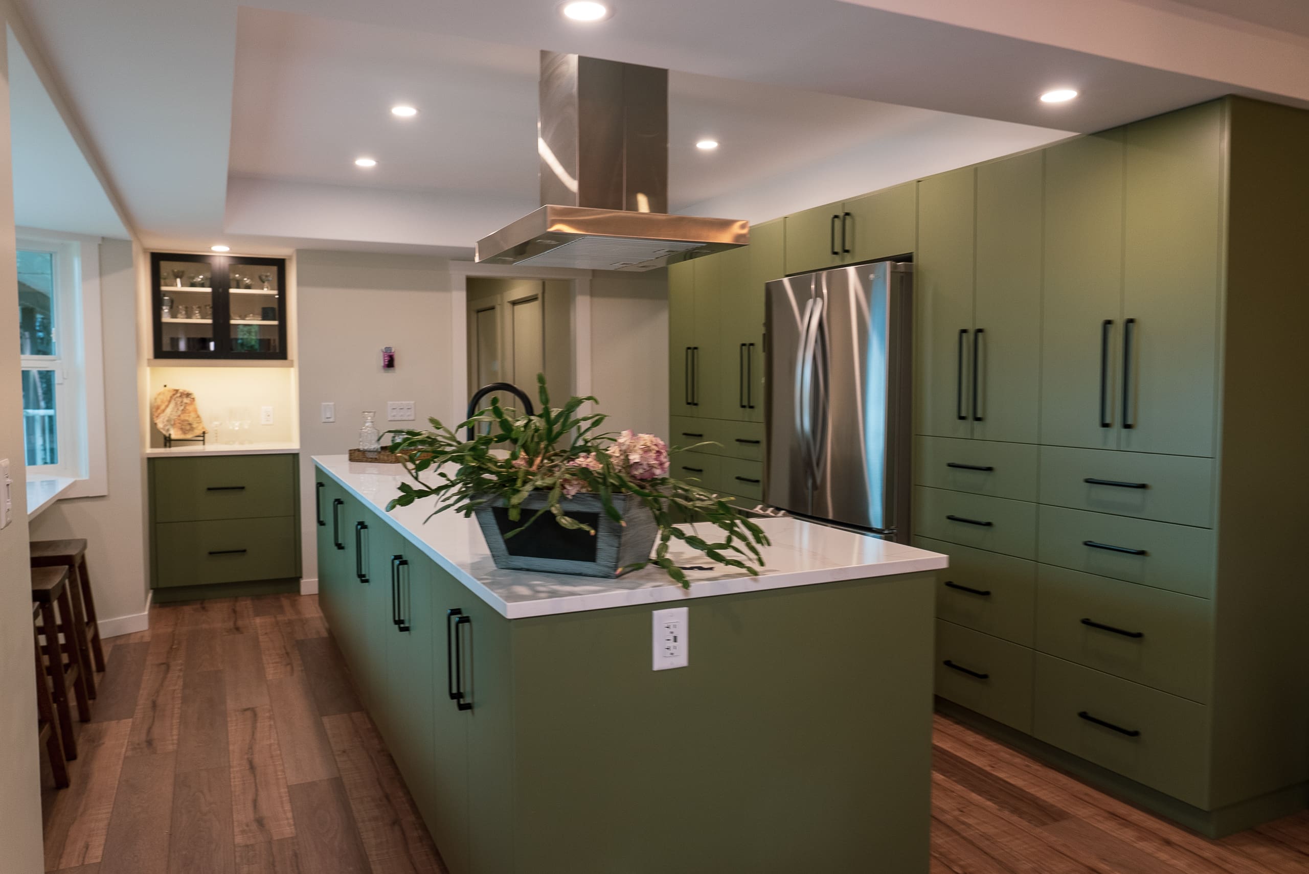
Green, being the colour of nature, promotes a feeling of freshness, growth, and harmony. It’s versatile and can be used in virtually any room to bring in a touch of the outdoors.
Yellow
Yellow is synonymous with sunshine and happiness. Its cheerful aura can brighten up spaces, making them warm and inviting. However, using yellow sparingly is wise, as excessive use can be overwhelming.
Orange
Orange is a vibrant and energetic colour that can evoke excitement and enthusiasm. It’s great for social spaces like living rooms that stimulate conversation and interaction.
Purple
Purple is often associated with luxury, creativity, and elegance. It can add a touch of sophistication and mystery to your interiors.
White
White signifies purity, cleanliness, and simplicity. It’s a great colour to create a sense of space, making it ideal for small rooms or those with a minimalist design.
Black
Black is solid and sophisticated but should be used sparingly to avoid making a room feel dark or heavy. It can be used as an accent colour to add depth and elegance.
Brown
Brown, like green, brings a natural, earthy feel to spaces. It’s associated with stability and reliability, making it a solid choice for family living areas.
Understanding these emotional associations can guide you in creating a balanced colour palette that aligns with the feelings you wish to evoke in different spaces within your home. Whether you desire a calming sanctuary, a vibrant social hub, or a sophisticated space, your chosen colours will play a pivotal role in realizing your vision.
Exploring Color Relationships:
The colour wheel is a fundamental tool that unveils the relationship between colours. Primary colours (red, blue, yellow) are the pillars from which other colours emanate. Combining them in different proportions yields secondary and tertiary colours, offering a broad spectrum to explore.
Complementary colours, opposite the wheel, create a vibrant contrast suitable for lively spaces. Analogous colours, being close to each other on the wheel, provide a serene and harmonious look. The choice between contrast and harmony is a personal one that significantly influences your home’s ambiance.
Impact of Lighting:
The interplay between light and colour plays a pivotal role in realizing the aesthetic potential of your home. Both natural and artificial lighting significantly impact how colours are perceived, and understanding this dynamic can guide you in making informed colour choices.
Natural Lighting:
- Sunlight is the purest form of light and reveals the truest colours. The amount of natural light a room receives can change throughout the day, altering the appearance of colours. Rooms with ample sunlight may make cool colours appear brighter, while warm colours can add coziness to a space with limited natural light.
- Consider the direction your windows face: north-facing rooms might have cooler, softer light, while south-facing rooms usually receive brighter, warmer light.
Artificial Lighting:
- Incandescent lighting: Casts a warm, yellowish glow that enhances reds, oranges, and yellows but may mute blues and greens.
- Fluorescent lighting: Provides a cool, blue light that can sharpen blues and greens but may dull warmer tones.
- LED lighting: Offers a vast range of colour temperatures, allowing for more accurate colour rendering.
- It’s advisable to have a mix of light sources at different levels to create a pleasing ambiance. For instance, combining overhead, floor, and table lamps allows for flexibility in controlling light intensity and distribution.
Colour Temperature:
- Colour temperature, measured in Kelvins (K), plays a role in colour perception. Warm lighting (lower Kelvin numbers) creates a cozy atmosphere, while cool lighting (higher Kelvin numbers) offers a crisp, invigorating ambiance.
Reflective Surfaces:
- Reflective surfaces, including floors, ceilings, and furniture, can also influence colour perception. Light-colored surfaces reflect more light and may alter the appearance of your chosen colours.
Testing Before Deciding
The commitment to a colour palette should come after thorough testing in the space where the colours will be applied.
Sample Swatches:
- Obtain paint samples or swatches and apply them to different walls in the room. Observing how the colours look at various times of the day under different lighting conditions is crucial for an accurate representation.
Sample Boards:
- Consider painting large boards with your sample colours and moving them around the room. This allows you to see how the colours interact with furniture and other elements within the space.
Digital Visualization Tools:
- Utilize digital tools and apps that allow you to upload photos of your space and virtually paint the walls. While not a substitute for physical testing, digital visualization can provide a preliminary understanding of how your chosen colours might look.
Professional Colour Consultation:
- Engaging a professional colour consultant can provide valuable insights and avoid potential missteps. They bring expertise in understanding colour interactions and can suggest options that align with your vision.
Living with the Colour:
- Live with the sample colours for a few days or weeks to ensure you’re comfortable choosing different lighting conditions and moods.
Through thoughtful examination and testing, you can confidently select a colour palette that will enhance the beauty and ambiance of your home, ensuring satisfaction with the result for years to come.
Professional Consultation
Engaging professionals like Master Painting & Renovations in your colour selection journey brings a wealth of expertise. Their experienced eyes and knowledge of colour trends and quality paints ensure that your chosen palette beautifies your home and stands the test of time.
Budget Consideration
Quality paints are a wise investment. They offer superior coverage, longevity, and the truest representation of colours. Allocating a reasonable budget for suitable quality paints ensures your home remains alluring for years.
Conclusion
Unveiling the perfect colour palette for your home is a rewarding endeavour that breathes life into your space. With a blend of personal reflection, professional guidance, and a touch of adventure, your home renovation project could begin a beautiful colour journey that tells your story in vivid shades.