


When we think of home renovation, we often focus on the functional aspects—fixtures, flooring, and furniture. However, one of the most impactful and often overlooked design elements is the colour of the walls. Paint colour doesn’t just set the tone for your home’s aesthetic; it also profoundly affects your mood and emotional well-being.
Studies show that different colours can evoke a wide range of feelings, from calmness and relaxation to energy and excitement. This comprehensive guide will walk you through how different wall colours can influence your mood and how to make the best choices for each room in your home.
Understanding Colour Psychology
Colour psychology is the study of how colours affect human behaviour and mood. The way we respond to colour is influenced by cultural, psychological, and physiological factors. For instance, while a bright yellow might be invigorating for some, it could feel overwhelming to others.
In the context of home design, choosing the right wall colour involves more than simply picking what looks good. It’s about creating a space that enhances your emotional state and aligns with the room’s purpose. Below, we’ll break down the most common colours and how they typically affect mood.
Understanding colour psychology helps you choose paint colours that evoke the right emotions and create the desired atmosphere in a space.
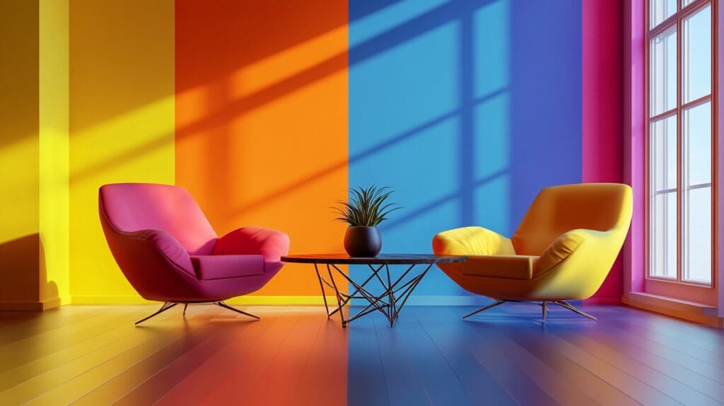
Warm Colours: Energizing and Invigorating
Warm colours like red, orange, and yellow tend to evoke feelings of energy and excitement. These colours are stimulating and can make a space feel more lively and dynamic.
- Red: Known for its intensity, red is a colour that demands attention. It can increase energy levels and create a sense of urgency or excitement. This makes it an excellent choice for social spaces like dining rooms or living rooms where you want to encourage conversation and interaction. However, too much red can also provoke anxiety, so it’s best used as an accent rather than covering an entire room.
- Orange: Orange is warm and welcoming, often associated with enthusiasm and creativity. It’s a fantastic choice for areas where people gather, such as kitchens or playrooms. Orange can help foster a friendly, energetic atmosphere, but like red, it’s important not to overdo it.
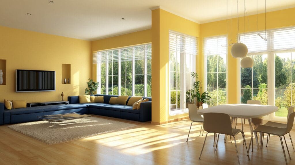
- Yellow: Bright and cheerful; yellow is associated with happiness and optimism. It works well in spaces that receive a lot of natural light, like kitchens or sunrooms, as it amplifies the sense of brightness and joy. However, too much yellow can cause frustration or agitation, especially in overly bright or small spaces.
Warm paint colours bring energy and vibrancy to a space, making it feel more invigorating and lively.
Cool Colours: Calming and Relaxing
Cool colours such as blue, green, and purple are typically seen as soothing and relaxing. These colours tend to make a room feel more spacious and tranquil, which is why they’re popular in bedrooms, bathrooms, and other areas meant for relaxation.
- Blue: Blue is one of the most popular colours for interiors due to its calming and serene nature. Light blues work well in bedrooms and bathrooms, creating a peaceful, spa-like environment. Darker blues can evoke a sense of stability and sophistication, making them suitable for offices or living rooms. However, using too much dark blue can make a space feel cold or uninviting.
- Green: Green is the colour of nature and balance. It’s a versatile colour that can evoke both calm and energy, depending on the shade. Light greens, such as sage, are perfect for bedrooms or living rooms where relaxation is key. Brighter greens can add a touch of vitality to kitchens or home offices, promoting creativity and focus.
- Purple: Purple is often associated with luxury and creativity, but purple can bring a sense of drama and sophistication to a space. Lighter shades like lavender are calming, making them ideal for bedrooms or quiet sitting areas. Darker purples like eggplant can add richness to dining rooms or entryways but should be used sparingly to avoid making a room feel too dark or overwhelming.
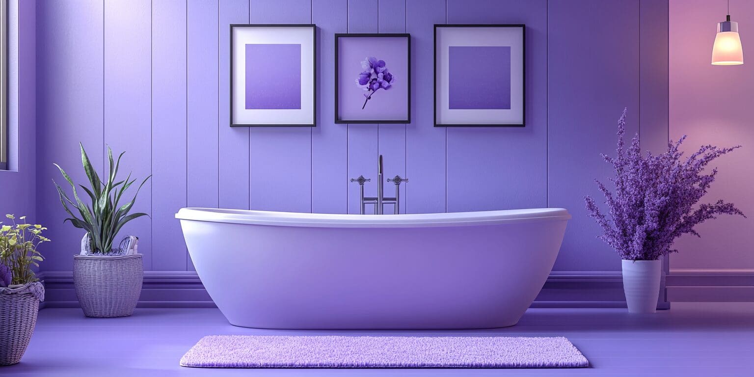
Cool paint colours evoke a sense of calm and serenity, perfect for creating a relaxing atmosphere.
Neutral Colours: Versatile and Timeless
Neutral colours like white, grey, and beige are popular for their versatility. While they may not evoke strong emotions like bold colours, they provide a blank canvas that allows you to layer in personality with furniture, art, and decor.
- White: White symbolizes cleanliness, purity, and simplicity. It can make a room feel larger and more open, which is why it’s a go-to for small spaces. White works well in kitchens, bathrooms, and entryways but can sometimes feel sterile if not paired with warmer accent colours or textures.
- Grey: Grey is a sophisticated, neutral choice that works well in almost any room. Depending on the shade, it can range from cool, calming tones to warm, welcoming ones. Lighter greys promote tranquillity, while darker greys offer a more dramatic, moody atmosphere. Grey is a fantastic choice for modern living rooms, bedrooms, and offices.
- Beige: Beige offers warmth and versatility, often providing a soft, inviting backdrop that works well with various decor styles. It’s an excellent option for living rooms, hallways, and bedrooms, where you want a calm, neutral environment that doesn’t distract from other elements of the room.
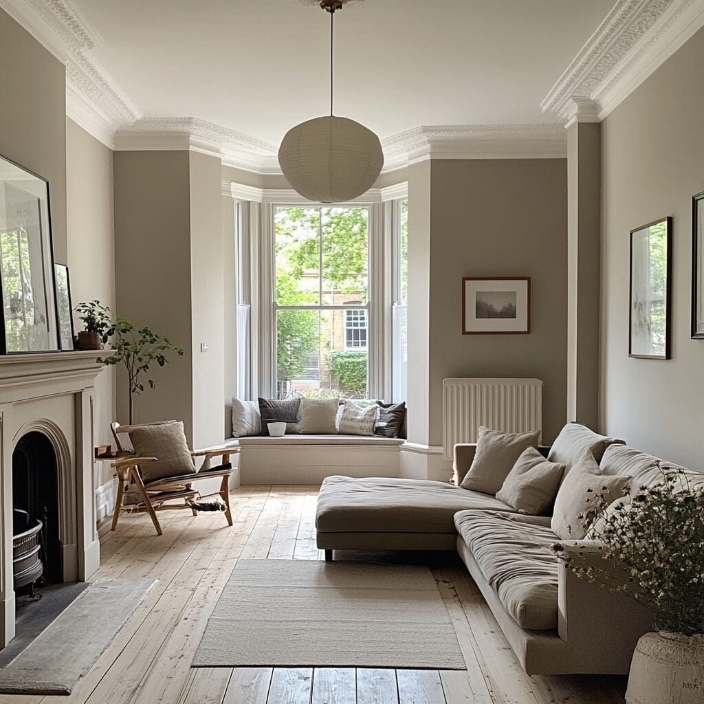
Neutral colours are highly versatile, effortlessly complementing any design style or decor
Choosing the Right Colour for Each Room
- Living Room: For a social, welcoming space, consider warm neutrals like beige or light grey, with pops of bolder colours in your accents. Soft greens or blues can create a calming environment if you want a more relaxed feel.
- Bedroom: Since this is a place for rest, cooler colours like light blues, soft greens, or lavender are ideal for promoting relaxation.
- Kitchen: Bright, energizing colours like yellow or orange can work well in kitchens, but if you prefer a cleaner, modern look, consider white or grey with colourful accents.
- Home Office: Choose calming but stimulating shades like soft green or blue to encourage focus and productivity. A deep navy can add sophistication without feeling overwhelming.
By carefully selecting the right paint colours, you can transform your home into a space that not only looks great but also feels just right for your needs.